by A. A. Rubin
Comic books and graphic novels are unique among storytelling mediums. While it shares characteristics with both prose and screenwriting, how the words and art interact on the page gives comics their own set of techniques. It is important for writers to understand how a finished comics page works to take full advantage of the medium’s unique properties. In this article, I will break down a comics page from a short superhero parody I wrote, both sequentially and holistically, to show how the story is told on the page by the words, the art, and the interaction between the two.
The page comes from a story written by me and illustrated by Evan Scale, “Mr Stupendous: In the Clutches of Doctor When.” It follows Mr. Stupendous as he battles Doctor When, a villain who can travel through time. The story was published in Creator Connection, Panel 2 (Comic Book School). Evan won the 2021 Independent Creator Award for Sequential Layout for this page.
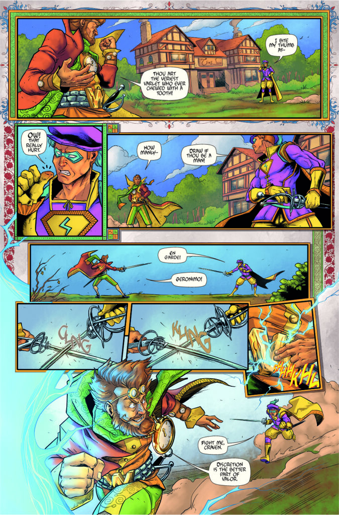
Page from “Mr Stupendous: In the Clutches of Doctor When,” written by A. A. Rubin and illustrated by Evan Scale.
Panel 1: Setting the Scene
The first panel is an establishing shot that runs the width of the page. When a scene begins in a new location, it’s essential to establish the setting. Contemporary comics frown upon descriptive text, so it is important to situate the reader, especially if the scene has changed since the previous page. Here, the tavern and costumes establish the Renaissance period in England. The reader will know where and when this part of the story occurs based on the visual cues before they even engage with the dialogue. The switch to Shakespearean English (the previous page took place in a far-future anime world) will not be jarring because the reader’s expectations have been set at first glance.
The character on the left speaks first. The reader will see the character on the left first because they naturally read the page left to right (in American comics), so the character they see first should speak first.
Panels 2–7: Distance and Action
Panel 2 is a closeup. Camera angles and distances are critical in visual storytelling, and the joke, based on a famous line in Romeo and Juliet, works best if the focus is on Mr. Stupendous’s thumb.
Panel 3 zooms back out to set up the conflict on the bottom half of the page.
Panels 4–8 control the distance to mimic the story’s action. The initial setup depicts a considerable distance between the two characters. Panel 4 reestablishes that distance by, once again, using a panel that runs the width of the page. The distance is accentuated because the panel is narrow vertically. Though the actual width of the panel is slightly shorter than the first horizontal panel, this panel reads longer because of its shape.
Panels 5–7: The Ratio Between Text and Art
As the characters close with each other, the camera closes as well. Panels 5–7 are tight shots, each highlighting a single action. Each panel can depict only one action, and one of the biggest mistakes novice comics writers make is trying to write multiple actions into a single panel.
In these panels, art carries the story rather than dialogue. The absence of text allows the reader to move through these panels quickly, which is important in an action sequence, especially as multiple small panels can slow the pace of the storytelling. The choice not to continue the banter counteracts the effect of the multiple smaller panels on the eye.
The writer must also consider whether there is room for both the dialogue and the art. A panel with too much text must be drawn larger. Overwriting can affect the pacing and limit the artist’s layout choices.
The Final Panel: Structure and Movement
The final panel is, again, large to accentuate the growing distance between the characters, and the perspective has shifted so the action moves toward the reader. This creates dramatic tension. The effect is enhanced because this is an open panel. It is not confined by a bounding box. The lack of borders minimizes the separation between the reader and the action. It is similar to the effect of an actor leaving the stage and coming into the audience. The portal sucks everything into the scene on the following page: Doctor When, Mister Stupendous, and, ultimately, the reader.
The Page Holistically: Story, Theme, and Cliffhanger
As the reality of the scene breaks down, so does the page’s layout. The top of the page is rigidly structured. There are clear borders for each panel, as well as a global background of period-appropriate paper. After the portal is activated, and time becomes wibbly-wobbly, the panels and background become less structured and more freeform. Thus, the layout mimics the action.
The structure not only suits the action but also hints at the story’s themes. It begins with a large full-width panel, funnels down to smaller panels in the middle, and widens back to a full-width panel at the bottom. The panels in the middle of the page shrink in from the page’s edges, accentuating this movement. This not only achieves a visual balance but also creates an hourglass effect, a symbol of time—and of time running out—in a story that features time travel and a chase, which adds another layer to the storytelling.
There are also a couple of holistic factors to consider. While each comics page tells part of a larger story, it is best if it contains its own story arc as well. Here, the characters banter; they fight, and one of them flees. There is a clear beginning, middle, and end.
But it’s not a true ending. In the final panel, Doctor When escapes through a portal, but the reader doesn’t know where (or in this case, when) that portal leads. This cliffhanger creates anticipation for the next part of the story and keeps the reader immersed in the action on the page turn.
Conclusion
There are many factors to consider when writing comics. There are more techniques than can fit on any single page, but this one includes many of the basics. While the artist will likely take on much of the visual storytelling responsibility, it behooves the comics writer to understand the sequential page and to write the script in a way that both makes life easier for the artist and takes advantage of the unique aspects of the comics medium.
Additional Resources
- Comics and Sequential Art: Principles and Practices From The Legendary Cartoonist by Will Eisner
- Understanding Comics: The Invisible Art by Scott McCloud
- Alan Moore’s Writing For Comics
Explore more articles from THE COMICS PANEL
 Cast out of the universe like cosmic Cain, A. A. Rubin roams the planes of reality, jumping through the variegated permutations of the multiverse across the dimensions of space and time. A member of SFWA and the HWA, his work has appeared recently in Pseudopod, Trollbreath, The Best Climate Change Stories (Secant), and Ahoy! Comics. Doomed to travel and record, but never find a home, he chronicles his adventures across social media as @TheSurrealAri and can be reached—in most realities—through his website, www.aarubin.com.